New yachts and new destinations aren’t the only things changing at Windstar. Yes, we’ve changed our logo! So why did we do that?
In short, as Windstar continues to expand and redefine itself, we wanted a fresh new look that put greater emphasis on the Windstar name in a classy, yet contemporary style.
Inspired by our continued commitment to unique and intimate luxury travel, the new logo dramatizes Windstar’s casually elegant, yacht style experience in the cruise industry.

We made the move from a sans serif typeface to serif typeface to reflect a more elegant look that aligns with the traditions of hospitality and grace that are core to Windstar’s guest experience. The flourish and the star are informal design elements that represent the water, the breeze and the clear nights experienced on a Windstar voyage. The type’s dark blue color is a gesture to the expansive and intriguing waters of the world, with the light blue as a symbol of the open sky. Together, these elements embody the Windstar brand essence.
The logo change is part of a comprehensive plan to refine marketing communications including a new web site later this year. The first yacht transformed with the new logo is the new Star Pride departing on its maiden voyage May 5, 2014 from Barcelona, Spain.
Here’s a peak at some of the places where the new logo is popping up …
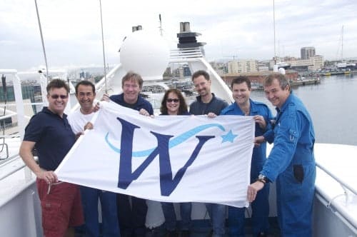
Star Pride – Windstar took possession of the new yacht on April 17.

The Wupcake – Windstar’s unique treat unveiled at the Employee Logo Party
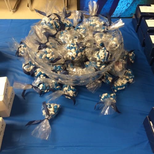
Personalized M&Ms with our new Insignia
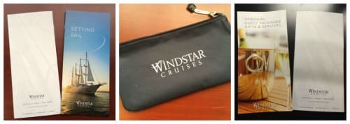
Guest Materials – Some of the first materials produced (because guests come first!)
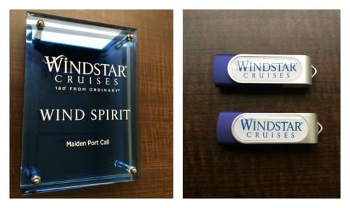
We are very proud of the new logo and hope you like it to. And thanks to many people and partners who have helped create and implement the new look!




I love the new logo – but there’s a part of me that is sad the old one is gone as it’s attached to lots of shirts with lots ot memories of great adventures. However now I get to move to new memories and a new yacht come July.
Sorry, disappointed with new look. Unfortunately its always easier to be a critic than a fan on the internet. While the existing logo was used in a tired manner. A simple rethink and re-application of the existing logo type likely would have achieved more of your goals than the new logo does. There was a classic (not classy) understated elegance to the existing typography that was unique amongst Cruise brands. Now the new logo feels bland generic. It feels like it came out of an in-house design team without much inspiration. It fails to even meet the level of design… Read more »
Did anyone else think it looks familiar? Have a look at the Make-a-Wish foundation logo?
I like both logos, but the new one is more according to what’s trending in fonts right now.
I like the new Windstar Logo, however, I don’t like the new web site. In particular the blue menu at the bottom. Would you get rid of that? It is annoying, makes it harder to read the information you want to read, is in the way. I believe it would be better to have this menu be collapsable.
Also, I’m unable to get any results for ‘Single Travel’. Are singles not encouraged to join a cruise?
Hi Susan,
Thanks for your feedback, we are constantly looking for ways to improve our website, we will pass this on to our marketing team.
As for the single rates, we are offering some single supplement cruises, please contact our VacationPlanning department for more information.
Thanks!